
Mechanize
March 23, 2026
I redesigned a company's website to get a job there (spoiler: it didn't work).
This story begins on a Friday morning in late February, 2026. I was going through my job alert emails and saw Indeed was pushing a job for a Junior SWE from a company called Mechanize. The job description seemed like a pretty good fit, and it sounded like a cool interesting space to work in… not to mention the salary for a junior was massive. Needless to say- I was highly motivated to stand out. I started doing my usual due diligence- combing through their website to learn more about them and what they are after.
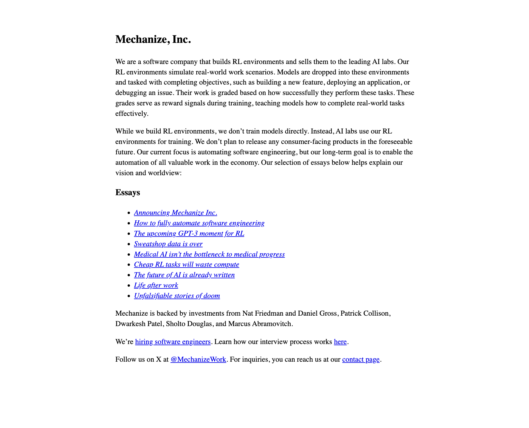
One thing about them to note- their website is bare bones. I'm talking single-column, left-aligned text, no navbar, no hero, serif typing, no CSS, actual white background (like #fff white), pure black text. I completely understand that the brutalist design was intentional- they are a cutting edge company, they want to project that the styling doesn't matter- they are serious, they do real tech work.
The more I clicked through though, the more I considered what I would do differently in terms of styling. And fiddling with my resume and writing those intro LinkedIn messages is the absolute f******cking worst. So, what harm could come from spending 30 minutes spinning up a quick HTML project to play around with styling? I needed a creative outlet, and AI makes these kinds of things so fast.
What I noticed poking around their site
My initial analysis of their website before I started coding:
- The aforementioned brutalist styling- no responsive layout, no mobile breakpoints, and all static HTML
- Entirely separate pages for and , despite having very little content on either page
- Their website hierarchy seems to highly prioritize their articles. Since each article was on its own page, it had its own URL- this could be an optimization in sharing for posts on social media, LinkedIn, etc.
- They do have a small section for their investment backers- which has some heavy hitters, but it was at the bottom of the page and didn't seem too in-your-face. I'm thinking that was a subtle flex- nice.
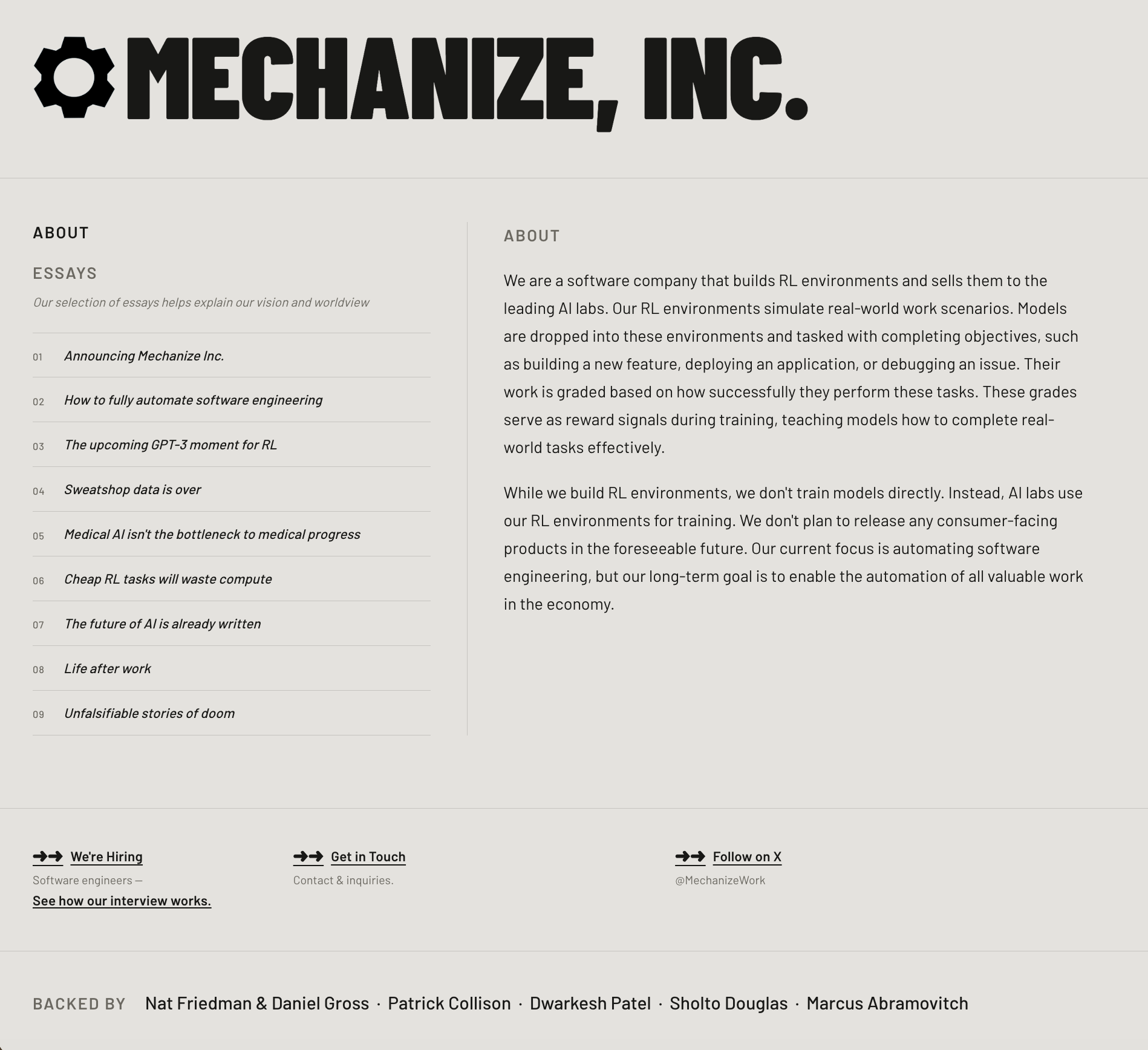
I wanted to keep the redesign fairly minimal- it should be all about the articles and text. It should feel both serious and classic/timeless. I wanted to make it more dynamic, with mobile optimization, but keep it so that everything feels intentional and purposefully incorporated.
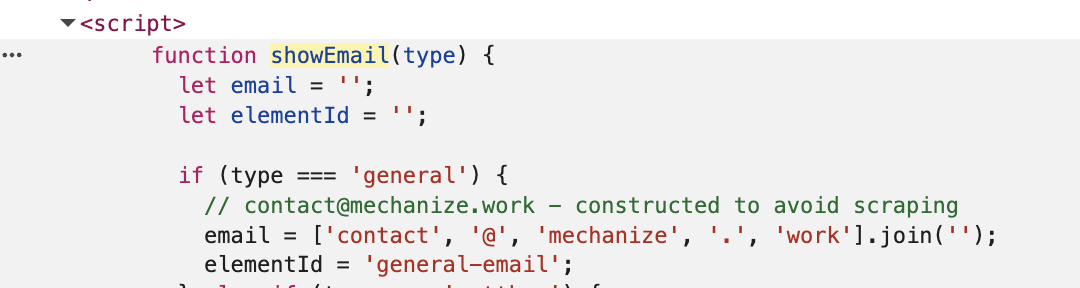
Another thing I noticed was their contact page had two email addresses listed, but they were “click to reveal email”. It seemed unusual, so I opened up the inspector because the super suspicious person in me was like “is this going to do something nefarious?”. Turns out they had a function called showEmail that stored the components of their email addresses as a list and then joined them. They even had a nice little comment by it "constructed to avoid scraping". Ok- so not nefarious, but cool and an interesting consideration.
While I had the inspector open anyways, I noticed they used a tool called Hugo- a quick search told me that was a super fast static site generator. So their website was static HTML- fast, cheap, no code execution needed. Seemed lean, reliable, and possibly good for SEO, although I doubt that was their focus.
Decisions, decisions

Welp- now I was in too deep. I wanted to not only give them a new style, but also challenge myself with considering how to do this while keeping their priorities: preventing web scraping, independent URLs for articles while including them on my single-page design, and simultaneously doing static HTML for quick, reliable, simple builds. Challenge accepted (obviously with Cursor's help).
I had an idea about the layout. Before starting anything at all though, I had an ask-only chat session with Cursor (it's been a while, so I don't recall if I had an LLM version selected or if it was on auto). We discussed:
- Tradeoffs between Hugo/static pages and SPA
- Is there a clean way to get the SPA feel without giving up the SEO and URL benefits of static?
- What's the most efficient way to grab all the content with correct tags and links intact? Can Cursor or Claude help me with that in a way that is completely accurate and does not vary at all from the original content?
- What does it actually take to do SEO and social previews right on a static site?
- To prevent web scraping: does the fact that they actually include the email in the comment render the web scraping step useless? And is the array joining the best way to prevent scraping?
- I ended up using a different method obfuscation, but it turns out neither of the methods are effective against modern bots.
- I did take out their full emails that were included in the comments section though. (in the "showEmail" screenshot above)
- Given all of the considerations, what's the best stack that keeps all the priorities listed, and keeps it clean and maintainable?
I described the layout, fonts, color scheme, etc., and had Cursor build out the plan and execute.
Now, this was a month ago, and I don't recall exactly what tweaks I made, but I think it was pretty close and it was mostly user experience tweaks. Instead of Hugo, I made a Python script to generate static HTML- giving each essay its own URL while preserving the fluid feel of a single-page application. After it was wrapped up, I opened a new cursor agent and asked it to evaluate the code for anything deprecated, anything redundant, and just generally making sure it was clean and efficient. Back in agent mode, I asked it to clean up anything listed. I ran through the changes, checked the local host, and after verifying that nothing was broken, I did it again. The second time it felt like Cursor was grasping at straws- I think it made one or two very optional suggestions but nothing seemed worth making further changes.
One final thing I did that drove me absolutely crazy on their original site- I converted their logo to an SVG with a clear background so that it looked great as the Favicon, and was able to use it on the header too.
Deliverance
Mission accomplished!
I was pleased with how it looked, and I think I did a good job maintaining all their previous site's priorities.
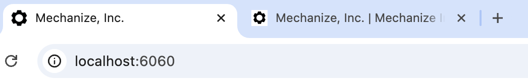
Now to send it. I intentionally did not put it on GitHub- after all, I was using all their IP with their essays and messaging. Instead, I thought the best way was to zip up the directory and send it to the CEO (his email was the only personal email on their website, the company was still super small so- whatever). I did also include a outlining the choices I made. I applied for the job, and then emailed the CEO with the zipped folder, and a gif showing the app running on my local host (in fact, the one that is included here!) so that he could see what it was without any effort.
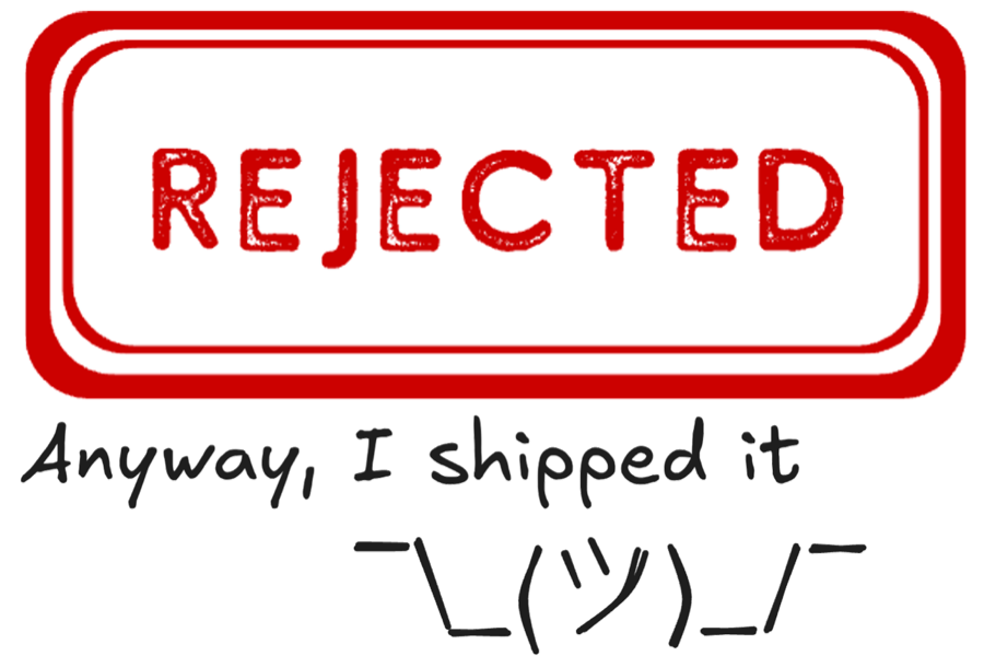
That went out around 5pm that same day. My rejection came the next day- Saturday- at almost the same time. I feel like it is safe to assume that it was based on the email / website redesign given the timing, but we will never know. On the bright side- it was a fun exercise, and I did learn quite a bit!
And thus began my new strategy. So far, not at all effective for jobs, but engaging for me. Anyway, I shipped it ¯\_(ツ)_/¯